# Régression de Poisson
<!-- paragraph -->
```{r setup, echo=FALSE}
knitr::opts_chunk$set(fig.path="Ch13-figures/")
```
<!-- paragraph -->
L'objectif de ce chapitre est de créer une visualisation des données interactive qui explique [la régression de Poisson][(https://en.wikipedia.org/wiki/Poisson_regression)](https://fr.wikipedia.org/wiki/R%C3%A9gression_de_Poisson), un modèle d'apprentissage automatique pour la prédiction d'une sortie à valeur entière à partir d'entrées sous forme de vecteurs à valeur réelle.
<!-- comment -->
Il s'agit d'un modèle de "régression linéaire" puisqu'il apprend une fonction linéaire des entrées à la sortie.
<!-- comment -->
Comme la régression par les moindres carrés, la régression de Poisson peut être formulée comme un problème de maximum de vraisemblance.
<!-- comment -->
Cependant, elle en diffère car elle utilise une distribution de Poisson pour modéliser les étiquettes de sortie, au lieu d'une distribution gaussienne.
<!-- comment -->
Ce choix de modélisation est approprié lorsque les étiquettes de sortie sont des nombres entiers non négatifs.
<!-- paragraph -->
Plan du chapitre :
<!-- paragraph -->
- Nous commençons par créer un graphique qui montre la fonction de masse de probabilité pour un paramètre moyen de la distribution de Poisson qui peut être sélectionné de manière interactive.
<!-- comment -->
- Nous ajoutons ensuite un deuxième panneau qui montre la fonction de distribution cumulative.
<!-- comment -->
- Nous ajoutons ensuite un second graphique qui montre la perte de Poisson, avec un second sélecteur pour la valeur de l'étiquette.
<!-- paragraph -->
## Tracer la fonction de masse de probabilité et sélectionner le paramètre moyen de Poisson. {#plot-prob-mass}
<!-- paragraph -->
L'objectif de cette section est de créer une visualisation des données qui montre la fonction de masse de probabilité pour un paramètre de moyenne de Poisson sélectionné.
<!-- paragraph -->
<!-- paragraph -->
```{r}
library(data.table)
poisson.mean.diff <- 0.25
poisson.mean.vec <- seq(0, 5, by=poisson.mean.diff)
quantile.max <- 0.99
poisson.prob.list <- list()
for(poisson.mean in poisson.mean.vec){
  label.max <- qpois(quantile.max, poisson.mean)
  label <- 0:label.max
  probability <- dpois(label, poisson.mean)
  poisson.prob.list[[paste(poisson.mean)]] <- data.table(
    poisson.mean,
    label,
    probability,
    cum.prob=cumsum(probability))
}
poisson.prob <- do.call(rbind, poisson.prob.list)
poisson.prob
```
<!-- paragraph -->
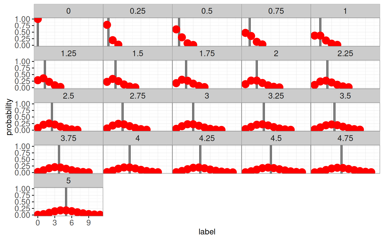
La visualisation des données statiques ci-dessous montre une facette pour chaque distribution de Poisson.
<!-- paragraph -->
```{r}
mean.tallrects <- data.table(
  poisson.mean=poisson.mean.vec,
  min=poisson.mean.vec - poisson.mean.diff/2,
  max=poisson.mean.vec + poisson.mean.diff/2)
library(animint2)
prob.mass <- ggplot()+
  theme_bw()+
  theme(panel.margin=grid::unit(0, "cm"))+
  geom_tallrect(aes(
    xmin=min, xmax=max),
    clickSelects="poisson.mean",
    alpha=0.6,
    data=mean.tallrects)+
  geom_point(aes(
    label, probability,
    tooltip=sprintf("prob(label = %d) = %f", label, probability)),
    color="red",
    showSelected="poisson.mean",
    size=5,
    data=poisson.prob)
prob.mass+
  facet_wrap("poisson.mean")
```
<!-- paragraph -->
Notez que nous avons utilisé `alpha=0.6` avec `geom_tallrect` ce qui signifie que le `tallrect` correspondant à la moyenne sélectionnée a une opacité de 0,6 et que les autres `tallrects` ont une opacité de 0,1.
<!-- comment -->
Notez également que nous utilisons`color="red"` et `size=5` avec `geom_point` afin qu'il soit plus facile de voir les points sur un fond gris et de passer le curseur sur les points pour voir l'infobulle.
<!-- comment -->
Nous allons maintenant créer une version interactive avec `animint2`.
<!-- paragraph -->
```{r Ch13-viz-prob}
animint(prob.mass)
```
<!-- paragraph -->
Vous pouvez cliquer sur la visualisation ci-dessus pour modifier la moyenne de la distribution de Poisson.
<!-- comment -->
Vous pouvez également survoler un point de données avec le curseur pour voir sa probabilité.
<!-- comment -->
Notez que pour les valeurs entières de la moyenne de Poisson, il existe deux étiquettes qui sont les plus probables (le mode de la distribution de Poisson).
<!-- comment -->
Par exemple, la distribution de Poisson avec une moyenne de 3 atteint sa probabilité maximale d'environ 0,224 pour des valeurs d'étiquettes de 2 et 3.
<!-- paragraph -->
## Ajouter un panneau pour la fonction de répartition {#panel-cdf}
<!-- paragraph -->
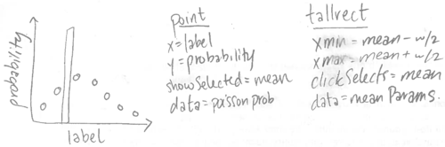
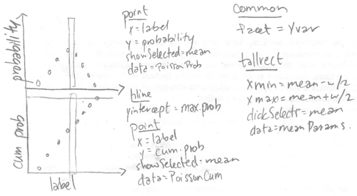
Pour ajouter un panneau à la fonction de répartition, nous allons modifier le ggplot en suivant l'esquisse ci-dessous.
<!-- paragraph -->
<!-- paragraph -->
Lorsque nous spécifions les ensembles de données, nous utilisons l'idiome [addColumn then facet](../Ch99/Ch99-appendix.html#addColumn-then-facet) pour ajouter une variable `panel`.
<!-- paragraph -->
```{r Ch13-viz-cum-prob}
addPanel <- function(dt, panel){
  data.table(dt, panel=factor(panel, c("probability", "cum prob")))
}
quantile.max.dt <- data.table(quantile.max)
animint(
  prob=ggplot()+
    theme_bw()+
    theme(panel.margin=grid::unit(0, "cm"))+
    facet_grid(panel ~ ., scales="free")+
    geom_hline(aes(
      yintercept=quantile.max),
      color="grey",
      data=addPanel(quantile.max.dt, "cum prob"))+
    geom_tallrect(aes(
      xmin=min, xmax=max),
      clickSelects="poisson.mean",
      alpha=0.6,
      data=mean.tallrects)+
    geom_point(aes(
      label, probability,
      tooltip=sprintf(
        "prob(label = %d) = %f", label, probability)),
      showSelected="poisson.mean",
      color="red",
      size=5,
      data=addPanel(poisson.prob, "probability"))+
    geom_point(aes(
      label, cum.prob,
      tooltip=sprintf(
        "prob(label <= %d) = %f", label, cum.prob)),
      showSelected="poisson.mean",
      color="red",
      size=5,
      data=addPanel(poisson.prob, "cum prob")))
```
<!-- paragraph -->
Notez que nous avons utilisé `addPanel` pour ajouter une variable `panel` à tous les ensembles de données pour chaque geom, à l'exception de `geom_tallrect`.
<!-- comment -->
Utiliser `panel` comme variable à facettes a pour effet de dessiner chaque geom dans un seul panneau, à l'exception de `geom_tallrect` qui est dessiné dans chaque panneau.
<!-- paragraph -->
Notez l'utilisation d'un `geom_hline` pour indiquer le seuil de la fonction de répartition, 0,99, servant à déterminer l'ensemble des points à tracer pour chaque distribution de Poisson.
<!-- comment -->
Ceci est un exemple de "montrer vos choix arbitraires", l'un des principes généraux de la conception de bonnes visualisations de données interactives.
<!-- paragraph -->
## Ajout d'un graphique de la perte de Poisson et d'un sélecteur pour la valeur de l'étiquette. {#plot-loss}
<!-- paragraph -->
Nous allons ensuite calculer la perte de Poisson pour plusieurs valeurs de l'étiquette de sortie.
<!-- paragraph -->
```{r}
PoissonLoss <- function(label, seg.mean){
  stopifnot(is.numeric(label))
  stopifnot(is.numeric(seg.mean))
  if(any(seg.mean < 0)){
    stop("PoissonLoss undefined for negative segment mean")
  }
  if(length(seg.mean)==1)seg.mean <- rep(seg.mean, length(label))
  if(length(label)==1)label <- rep(label, length(seg.mean))
  stopifnot(length(seg.mean) == length(label))
  not.integer <- round(label) != label
  is.negative <- label < 0
  loss <- ifelse(
    not.integer | is.negative, Inf,
    ifelse(seg.mean == 0, ifelse(label == 0, 0, Inf),
           seg.mean - label * log(seg.mean)
           ## This term makes all the minima zero.
           -ifelse(label == 0, 0, label - label*log(label))))
  loss
}
```
<!-- paragraph -->
Ci-dessous, nous calculons la perte pour plusieurs valeurs d'étiquettes, en utilisant la méthode [Liste de tableau de données](../Ch99/Ch99-appendix.html#list-of-data-tables).
<!-- paragraph -->
```{r}
label.vec <- unique(poisson.prob$label)
label.range <- range(label.vec)
mean.vec <- seq(label.range[1], label.range[2], l=100)
loss.min.list <- list()
loss.fun.list <- list()
for(label in label.vec){
  loss <- PoissonLoss(label, mean.vec)
  loss.fun.list[[paste(label)]] <- data.table(
    label, poisson.mean=mean.vec, loss)
  loss.min.list[[paste(label)]] <- data.table(
    label, loss=0)
}
loss.fun <- do.call(rbind, loss.fun.list)
loss.min <- do.call(rbind, loss.min.list)
```
<!-- paragraph -->
Nous créons également un tableau de données afin d'afficher des étiquettes de texte pour les valeurs de moyenne et d'étiquette sélectionnées.
<!-- paragraph -->
```{r}
mean.text <- data.table(
  label=max(poisson.prob$label)/2,
  probability=0.95,
  poisson.mean=poisson.mean.vec)
loss.max <- 10
label.text <- data.table(
  poisson.mean=max(mean.tallrects$max),
  loss=loss.max*0.95,
  label=label.vec)
```
<!-- paragraph -->
Ensuite, nous créons une visualisation des données avec un panneau supplémentaire.
<!-- paragraph -->
```{r Ch13-viz-loss}
(viz.loss <- animint(
  prob=ggplot()+
    theme_bw()+
    theme(panel.margin=grid::unit(0, "cm"))+
    facet_grid(panel ~ ., scales="free")+
    geom_text(aes(
      label, probability, label=sprintf(
      "Poisson mean = %.2f", poisson.mean)),
      color="red",
      showSelected="poisson.mean",
      data=addPanel(mean.text, "probability"))+
    geom_hline(aes(
      yintercept=quantile.max),
      color="grey",
      data=addPanel(quantile.max.dt, "cum prob"))+
    geom_point(aes(
      label, probability,
      tooltip=sprintf(
        "prob(label = %d) = %f", label, probability)),
      showSelected="poisson.mean",
      clickSelects="label",
      color="red",
      size=5,
      alpha=0.7,
      data=addPanel(poisson.prob, "probability"))+
    geom_point(aes(
      label, cum.prob,
      tooltip=sprintf(
        "prob(label <= %d) = %f", label, cum.prob)),
      color="red",
      showSelected="poisson.mean",
      clickSelects="label",
      size=5,
      alpha=0.7,
      data=addPanel(poisson.prob, "cum prob")),
  loss=ggplot()+
    theme_bw()+
    geom_text(aes(
      poisson.mean, loss,
      label=sprintf("label = %d", label)),
      showSelected="label",
      hjust=0,
      data=label.text)+
    geom_line(aes(
      poisson.mean, loss),
      showSelected="label",
      data=loss.fun)+
    geom_point(aes(
      label, loss),
      showSelected="label",
      data=loss.min)+
    geom_tallrect(aes(
      xmin=min, xmax=max),
      clickSelects="poisson.mean",
      alpha=0.6,
      data=mean.tallrects)))
```
<!-- paragraph -->
La visualisation des données ci-dessus montre la probabilité à gauche et la perte de Poisson à droite.
<!-- paragraph -->
```{r Ch13-viz-log-loss}
viz.log.loss <- viz.loss
addX <- function(dt, x.var)data.table(dt, x.var=factor(
  x.var, c("poisson mean", "log(poisson mean)")))
finite.loss <- loss.fun[is.finite(loss)]
finite.loss[, log.poisson.mean := log(poisson.mean)]
finite.log.loss <- finite.loss[is.finite(log.poisson.mean)]
mean.tallrects[, log.min := ifelse(min < 0, -Inf, log(min))]
viz.log.loss$loss <- ggplot()+
  theme_bw()+
  theme(panel.margin=grid::unit(0, "lines"))+
  facet_grid(. ~ x.var, scales="free")+
  xlab("")+
  coord_cartesian(ylim=c(0, loss.max))+
  geom_text(aes(
    poisson.mean, loss, label=sprintf(
                          "label = %d", label)),
    showSelected="label",
    hjust=0,
    data=addX(label.text, "poisson mean"))+
  geom_line(aes(
    poisson.mean, loss),
    showSelected="label",
    data=addX(finite.loss, "poisson mean"))+
  geom_point(aes(
    label, loss),
    showSelected="label",
    data=addX(loss.min, "poisson mean"))+
  geom_tallrect(aes(
    xmin=min, xmax=max),
    clickSelects="poisson.mean",
    alpha=0.6,
    data=addX(mean.tallrects, "poisson mean"))+
  geom_line(aes(
    log.poisson.mean, loss),
    showSelected="label",
    data=addX(finite.log.loss, "log(poisson mean)"))+
  geom_point(aes(
    log(label), loss),
    showSelected="label",
    data=addX(loss.min[0<label,], "log(poisson mean)"))+
  geom_tallrect(aes(
    xmin=log.min, xmax=log(max)),
    clickSelects="poisson.mean",
    alpha=0.6,
    data=addX(mean.tallrects, "log(poisson mean)"))
viz.log.loss
```
<!-- paragraph -->
## Résumé du chapitre et exercices {#Ch13-exercises}
<!-- paragraph -->
Nous avons expliqué comment visualiser la distribution et la perte de Poisson, qui sont utilisées pour le modèle de régression de Poisson.
<!-- paragraph -->
Exercices :
<!-- paragraph -->
- Le code ci-dessus utilisait les fonctions d'aide `addPanel` et `addX` avec plusieurs geoms pour créer des graphiques multi-panneaux, ce qui entraîne des répétitions.
<!-- comment -->
Pour les éviter, créez une nouvelle visualisation des données qui utilise un seul geom avec un ensemble de données plus important.
<!-- comment -->
Par exemple, les points rouges dans les deux panneaux du premier graphique pourraient être définis à l'aide d'un seul `geom_point` avec un ensemble de données plus important (Conseil : utilisez `data.table::melt` avec `measure.vars=c("cum.prob", "probability")`).
<!-- comment -->
- Créez une séquence similaire de visualisation des données pour le modèle de [Régression binomiale](https://en.wikipedia.org/wiki/Binomial_regression).
<!-- paragraph -->
Dans le [chapitre 14](../Ch14/Ch14-PeakSegJoint.html), nous vous expliquerons comment utiliser les `clickSelects/showSelected` explicites pour visualiser le modèle d'apprentissage automatique PeakSegJoint avec des variables de sélection basées sur les données.
<!-- paragraph -->