---
title: Lasso
layout: default
output: bookdown::html_chapter
---
Traduction de l'[anglais](https://github.com/tdhock/animint-book/)
[Ch11-lasso](https://raw.githubusercontent.com/tdhock/animint-book/master/Ch11-lasso.Rmd)
<!-- paragraph -->
```{r setup, echo=FALSE}
knitr::opts_chunk$set(fig.path="Ch11-figures/")
```
<!-- paragraph -->
L'objectif de ce chapitre est de créer une visualisation des données interactive qui explique le [Lasso](https://en.wikipedia.org/wiki/Lasso_%28statistics%29), un modèle d'apprentissage automatique pour la régression linéaire régularisée.
<!-- paragraph -->
Plan du chapitre :
<!-- paragraph -->
- Nous commençons par plusieurs visualisations de données statiques du chemin ("path") du lasso.
<!-- comment -->
- Nous créons ensuite une version interactive avec une facette et un graphique montrant l'erreur d'entraînement/validation et les résidus.
<!-- comment -->
- Enfin, nous remanions la visualisation interactive des données avec des légendes simplifiées et des `tallrects` mobiles.
<!-- paragraph -->
## Graphiques statiques du chemin ("path") de la régularisation du coefficient {#static-path-plots}
<!-- paragraph -->
Nous commençons par charger l'ensemble de données sur le cancer de la prostate.
<!-- paragraph -->
```{r}
if(!file.exists("prostate.data")){
  curl::curl_download(
    "https://web.stanford.edu/~hastie/ElemStatLearn/datasets/prostate.data",
    "prostate.data")
}
prostate <- data.table::fread("prostate.data")
head(prostate)
```
<!-- paragraph -->
Nous construisons un entrainement d'entrées `x` et des sorties `y` à l'aide du code ci-dessous.
<!-- paragraph -->
```{r}
input.cols <- c(
  "lcavol", "lweight", "age", "lbph", "svi", "lcp", "gleason",
  "pgg45")
prostate.inputs <- prostate[, ..input.cols]
is.train <- prostate$train == "T"
x <- as.matrix(prostate.inputs[is.train])
head(x)
y <- prostate[is.train, lpsa]
head(y)
```
<!-- paragraph -->
Ci-dessous, nous procédons à l'ajustement du chemin complet des solutions lasso à l'aide du package `lars`.
<!-- paragraph -->
```{r}
if(!requireNamespace("lars"))install.packages("lars")
library(lars)
fit <- lars(x,y,type="lasso")
fit$lambda
```
<!-- paragraph -->
Les chemins des valeurs `lambda` ne sont pas uniformément espacés.
<!-- paragraph -->
```{r}
pred.nox <- predict(fit, type="coef")
beta <- scale(pred.nox$coefficients, FALSE, 1/fit$normx)
arclength <- rowSums(abs(beta))
path.list <- list()
for(variable in colnames(beta)){
standardized.coef <- beta[, variable]
path.list[[variable]] <- data.table::data.table(
step=seq_along(standardized.coef),
lambda=c(fit$lambda, 0),
variable,
standardized.coef,
fraction=pred.nox$fraction,
arclength)
}
path <- do.call(rbind, path.list)
variable.colors <- c(
"#E41A1C", "#377EB8", "#4DAF4A", "#984EA3", "#FF7F00", "#FFFF33",
"#A65628", "#F781BF", "#999999")
library(animint2)
gg.lambda <- ggplot()+
theme_bw()+
theme(panel.margin=grid::unit(0, "lines"))+
scale_color_manual(values=variable.colors)+
geom_line(aes(
lambda, standardized.coef, color=variable, group=variable),
data=path)+
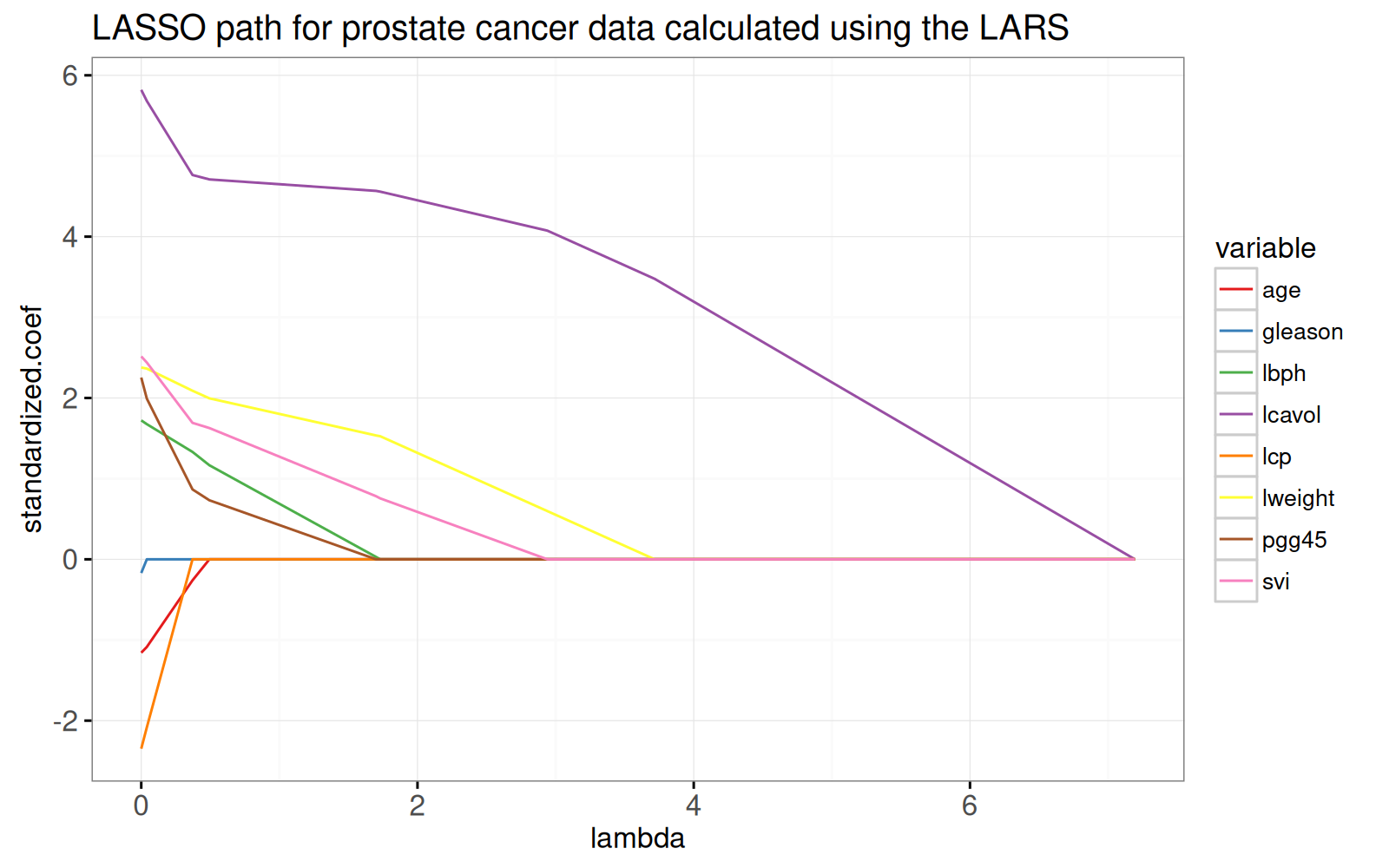
ggtitle("LASSO path for prostate cancer data calculated using the LARS")
gg.lambda
```
<!-- paragraph -->
Le graphique ci-dessus montre l'ensemble du chemin de lasso, les pondérations optimales dans le problème de régression par moindres carrés régularisés L1, pour chaque paramètre de régularisation lambda.
<!-- comment -->
Le chemin commence à la solution des moindres carrés, `lambda=0` à gauche.
<!-- comment -->
Il se termine par le modèle à ordonnée à l'origine complètement régularisé à droite.
<!-- comment -->
Pour voir l'équivalence avec la solution des moindres carrés ordinaires, nous ajoutons des points dans le graphique ci-dessous.
<!-- paragraph -->
```{r}
x.scaled <- with(fit, scale(x, meanx, normx))
lfit <- lm.fit(x.scaled, y)
lpoints <- data.table::data.table(
  variable=colnames(x),
  standardized.coef=lfit$coefficients,
  arclength=sum(abs(lfit$coefficients)))
gg.lambda+
  geom_point(aes(
    0, standardized.coef, color=variable),
    data=lpoints)
```
<!-- paragraph -->
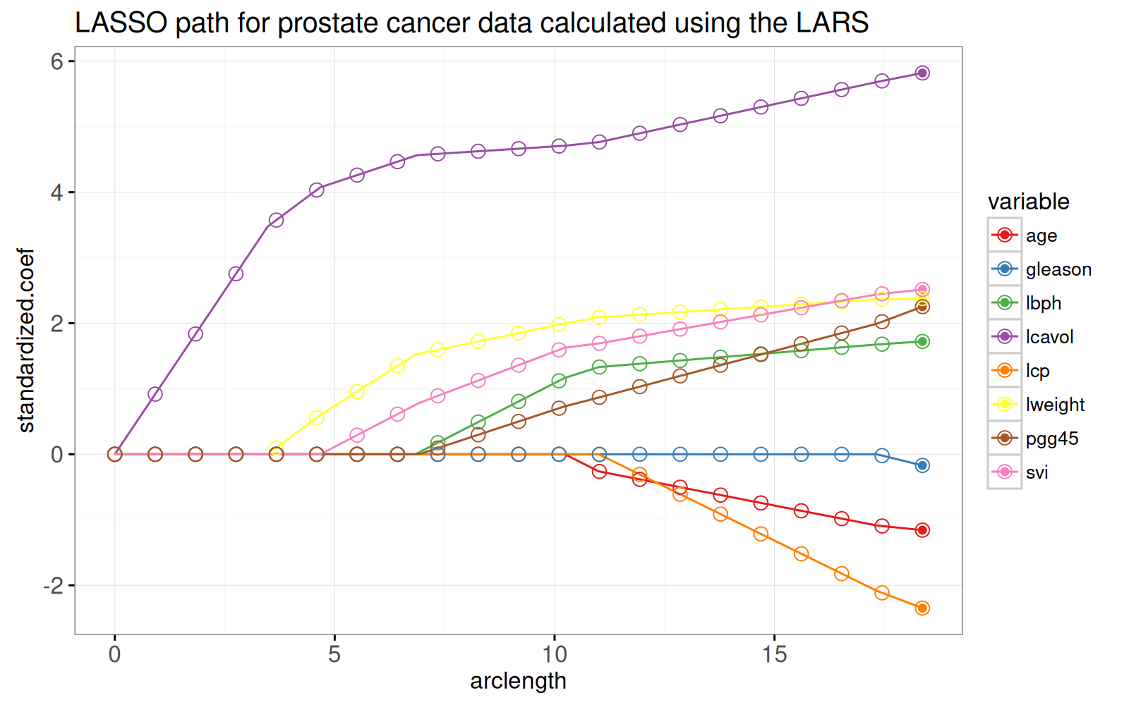
Dans le prochain graphique ci-dessous, nous montrons le chemin en fonction de la norme L1 (arclength), avec quelques points supplémentaires sur une grille régulièrement espacée que nous utiliserons plus tard pour l'animation.
<!-- paragraph -->
```{r}
fraction <- sort(unique(c(
  seq(0, 1, l=21))))
pred.fraction <- predict(
  fit, prostate.inputs,
  type="coef", mode="fraction", s=fraction)
coef.grid.list <- list()
coef.grid.mat <- scale(pred.fraction$coefficients, FALSE, 1/fit$normx)
for(fraction.i in seq_along(fraction)){
  standardized.coef <- coef.grid.mat[fraction.i,]
  coef.grid.list[[fraction.i]] <- data.table::data.table(
    fraction=fraction[[fraction.i]],
    variable=colnames(x),
    standardized.coef,
    arclength=sum(abs(standardized.coef)))
}
coef.grid <- do.call(rbind, coef.grid.list)
ggplot()+
  ggtitle("LASSO path for prostate cancer data calculated using the LARS")+
  theme_bw()+
  theme(panel.margin=grid::unit(0, "lines"))+
  scale_color_manual(values=variable.colors)+
  geom_line(aes(
    arclength, standardized.coef, color=variable, group=variable),
    data=path)+
  geom_point(aes(
    arclength, standardized.coef, color=variable),
    data=lpoints)+
  geom_point(aes(
    arclength, standardized.coef, color=variable),
    shape=21,
    fill=NA,
    size=3,
    data=coef.grid)
```
<!-- paragraph -->
Le graphique ci-dessus montre que les pondérations aux points de la grille sont cohérentes avec les lignes qui représentent l'ensemble du chemin des solutions.
<!-- comment -->
L'algorithme LARS fournit rapidement des solutions Lasso pour autant de points de grille que vous le souhaitez.
<!-- comment -->
Plus précisément, étant donné que l'algorithme LARS ne calcule que les points de changement dans le chemin linéaire par morceaux, sa complexité temporelle ne dépend que du nombre de points de changement (et non du nombre de points de grille).
<!-- paragraph -->
## Visualisation interactive du chemin (path) de la régularisation {#interactive-path-viz}
<!-- paragraph -->
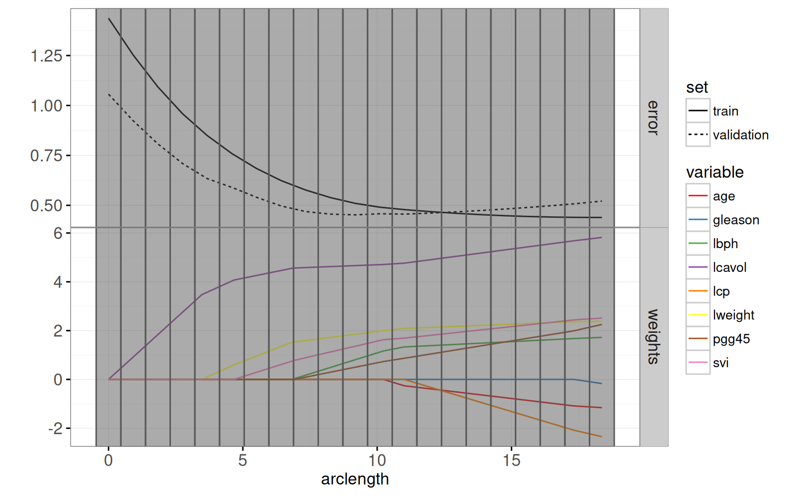
Le graphique ci-dessous combine le chemin des pondérations du lasso avec le graphique des erreurs d'entraînement/test.
<!-- paragraph -->
```{r}
pred.list <- predict(
  fit, prostate.inputs,
  mode="fraction", s=fraction)
residual.mat <- pred.list$fit - prostate$lpsa
squares.mat <- residual.mat * residual.mat
mean.error.list <- list()
for(set in c("train", "validation")){
  val <- if(set=="train")TRUE else FALSE
  is.set <- is.train == val
  mse <- colMeans(squares.mat[is.set, ])
  mean.error.list[[paste(set)]] <- data.table::data.table(
    set, mse, fraction,
    arclength=rowSums(abs(coef.grid.mat)))
}
mean.error <- do.call(rbind, mean.error.list)
rect.width <- diff(mean.error$arclength[1:2])/2
addY <- function(dt, y){
  data.table::data.table(dt, y.var=factor(y, c("error", "weights")))
}
tallrect.dt <- coef.grid[variable==variable[1],]
gg.path <- ggplot()+
  theme_bw()+
  theme(panel.margin=grid::unit(0, "lines"))+
  facet_grid(y.var ~ ., scales="free")+
  ylab("")+
  scale_color_manual(values=variable.colors)+
  geom_line(aes(
    arclength, standardized.coef, color=variable, group=variable),
    data=addY(path, "weights"))+
  geom_line(aes(
    arclength, mse, linetype=set, group=set),
    data=addY(mean.error, "error"))+
  geom_tallrect(aes(
    xmin=arclength-rect.width,
    xmax=arclength+rect.width),
    clickSelects="arclength",
    alpha=0.5,
    data=tallrect.dt)
print(gg.path)
```
<!-- paragraph -->
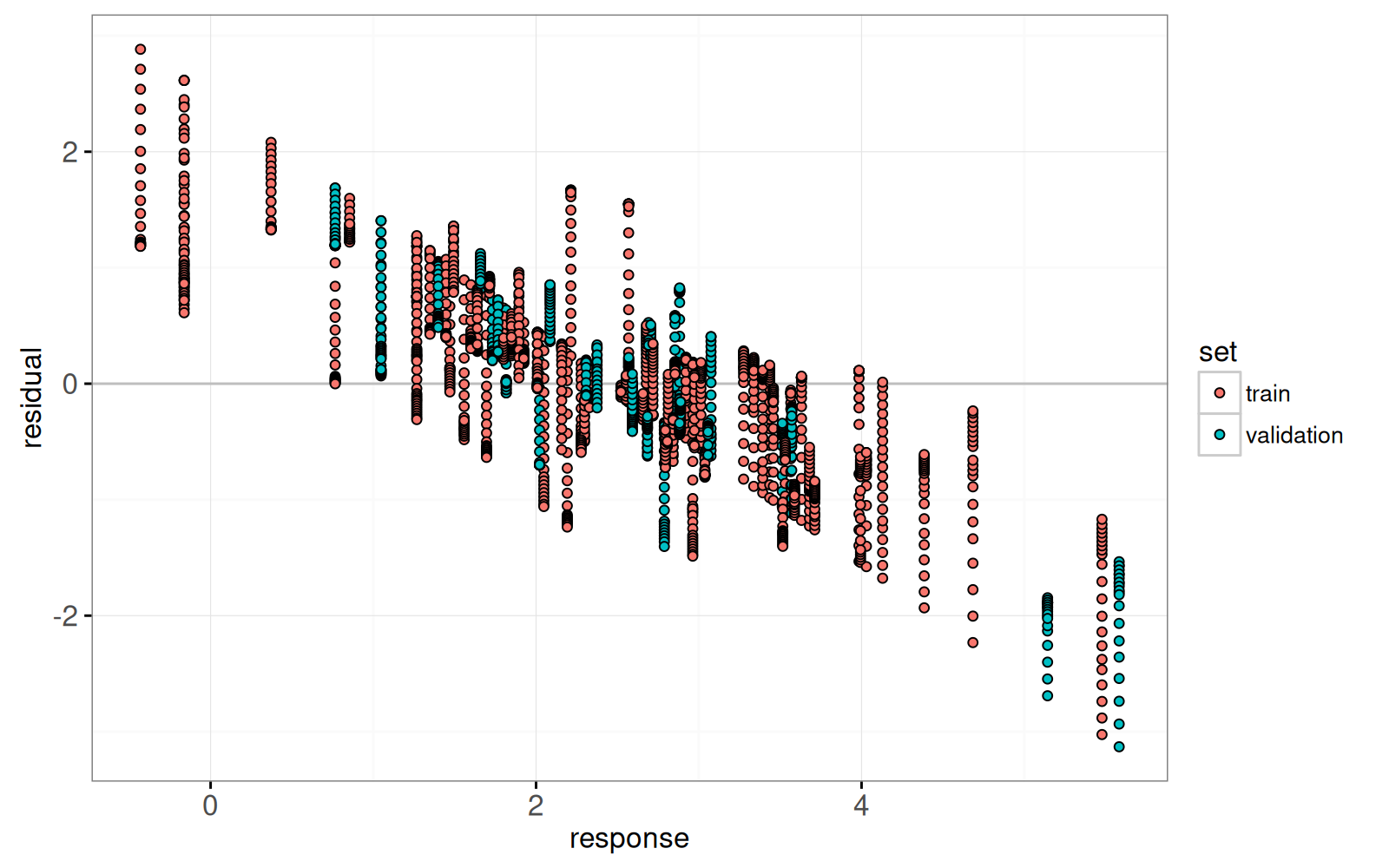
Enfin, nous ajoutons un graphique des résidus par rapport aux valeurs réelles.
<!-- paragraph -->
```{r}
lasso.res.list <- list()
for(fraction.i in seq_along(fraction)){
  lasso.res.list[[fraction.i]] <- data.table::data.table(
    observation.i=1:nrow(prostate),
    fraction=fraction[[fraction.i]],
    residual=residual.mat[, fraction.i],
    response=prostate$lpsa,
    arclength=sum(abs(coef.grid.mat[fraction.i,])),
    set=ifelse(prostate$train, "train","validation"))
}
lasso.res <- do.call(rbind, lasso.res.list)
hline.dt <- data.table::data.table(residual=0)
gg.res <- ggplot()+
  theme_bw()+
  geom_hline(aes(
    yintercept=residual),
    data=hline.dt,
    color="grey")+
  geom_point(aes(
    response, residual, fill=set,
    key=observation.i),
    showSelected="arclength",
    shape=21,
    data=lasso.res)
print(gg.res)
```
<!-- paragraph -->
Ci-dessous, nous combinons les ggplots ci-dessus en un seul `animint2`.
<!-- comment -->
En cliquant sur le premier graphique, on modifie le paramètre de régularisation et les résidus qui sont affichés dans le second graphique.
<!-- paragraph -->
```{r Ch11-viz-one-split}
animint(
  gg.path,
  gg.res,
  duration=list(arclength=2000),
  time=list(variable="arclength", ms=2000))
```
<!-- paragraph -->
## Refonte avec des `tallrects` mobiles {#re-design}
<!-- paragraph -->
Le refonte ci-dessous comporte deux changements.
<!-- comment -->
Tout d'abord, vous avez peut-être remarqué qu'il y a deux légendes de "set" différentes dans l'`animint2` précédent (`linetype="set"` dans le premier graphique de chemin et `color="set"` dans le second graphique de résidus).
<!-- comment -->
Il serait plus facile pour le lecteur de décoder si la variable "set" n'est mappée qu'une seule fois.
<!-- comment -->
Ainsi, dans la refonte ci-dessous, nous remplaçons le `geom_point` dans le deuxième graphique par un `geom_segment` avec `linetype=set`.
<!-- paragraph -->
Deuxièmement, nous avons remplacé le `tallrect` unique du premier graphique par deux `tallrects`.
<!-- comment -->
Le premier `tallrect` a `showSelected=arclength` et est utilisé pour afficher la longueur d'arc ("arclength") sélectionnée à l'aide d'un rectangle gris.
<!-- comment -->
Puisque nous spécifions une durée `duration` pour la variable `arclength` et la même valeur `key=1`, nous observerons une transition graduelle du `tallrect` gris sélectionné.
<!-- comment -->
Le deuxième tallrect a `clickSelects=arclength` et le fait de cliquer dessus a pour effet de modifier la valeur sélectionnée de `arclength`.
<!-- comment -->
Nous spécifions un autre ensemble de données avec plus de lignes, et utilisons les [variables clickSelects/showSelected nommées](Ch06-other.html#data-driven-selectors) pour indiquer que `arclength` doit également être utilisé comme une variable `showSelected`.
<!-- paragraph -->
```{r Ch11-viz-moving-rect}
tallrect.show.list <- list()
for(a in tallrect.dt$arclength){
  is.selected <- tallrect.dt$arclength == a
  not.selected <- tallrect.dt[!is.selected]
  tallrect.show.list[[paste(a)]] <- data.table::data.table(
    not.selected, show.val=a, show.var="arclength")
}
tallrect.show <- do.call(rbind, tallrect.show.list)
animint(
  path=ggplot()+
    theme_bw()+
    theme(panel.margin=grid::unit(0, "lines"))+
    facet_grid(y.var ~ ., scales="free")+
    ylab("")+
    scale_color_manual(values=variable.colors)+
    geom_line(aes(
      arclength, standardized.coef, color=variable, group=variable),
      data=addY(path, "weights"))+
    geom_line(aes(
      arclength, mse, linetype=set, group=set),
      data=addY(mean.error, "error"))+
    geom_tallrect(aes(
      xmin=arclength-rect.width,
      xmax=arclength+rect.width,
      key=1),
      showSelected="arclength",
      alpha=0.5,
      data=tallrect.dt)+
    geom_tallrect(aes(
      xmin=arclength-rect.width,
      xmax=arclength+rect.width,
      key=paste(arclength, show.val)),
      clickSelects="arclength",
      showSelected=c("show.var"="show.val"),
      alpha=0.5,
      data=tallrect.show),
  res=ggplot()+
    theme_bw()+
    geom_hline(aes(
      yintercept=residual),
      data=hline.dt,
      color="grey")+
    guides(linetype="none")+
    geom_point(aes(
      response, residual,
      key=observation.i),
      showSelected=c("set", "arclength"),
      shape=21,
      fill=NA,
      color="black",
      data=lasso.res)+
    geom_text(aes(
      3, 2.5, label=sprintf("L1 arclength = %.1f", arclength),
      key=1),
      showSelected="arclength",
      data=tallrect.dt)+
    geom_text(aes(
      0, -2, label=sprintf("train error = %.3f", mse),
      key=1),
      showSelected=c("set", "arclength"),
      hjust=0,
      data=mean.error[set=="train"])+
    geom_text(aes(
      0, -2.5, label=sprintf("validation error = %.3f", mse),
      key=1),
      showSelected=c("set", "arclength"),
      hjust=0,
      data=mean.error[set=="validation"])+
    geom_segment(aes(
      response, residual,
      xend=response, yend=0,
      linetype=set,
      key=observation.i),
      showSelected=c("set", "arclength"),
      size=1,
      data=lasso.res),
  duration=list(arclength=2000),
  time=list(variable="arclength", ms=2000))
```
<!-- paragraph -->
## Résumé du chapitre et exercices {#ch11-exercises}
<!-- paragraph -->
Nous avons créé une visualisation du modèle d'apprentissage automatique Lasso, qui montre de manière simultanée le chemin de régularisation et les courbes d'erreur.
<!-- comment -->
L'interactivité a été utilisée pour montrer les détails pour différentes valeurs du paramètre de régularisation.
<!-- paragraph -->
Exercices :
<!-- paragraph -->
- Refaites cette visualisation des données, en incluant le même effet visuel pour les `tallrects`, en utilisant un seul `geom_tallrect`.
<!-- comment -->
Conseil : créez un autre ensemble de données avec `expand.grid(arclength.click=arclength, arclength.show=arclength)` comme dans la définition de la fonction `make_tallrect_or_widerect`.
<!-- comment -->
- Ajoutez un autre nuage de points qui montre les valeurs prédites contre la réponse, avec un `geom_abline` en arrière-plan pour indiquer une prédiction parfaite.
<!-- comment -->
- À quoi ressembleraient les courbes d'erreur si l'on choisissait d'autres répartitions entraînement/validation ?
<!-- comment -->
Effectuez une validation croisée 4-plis et ajoutez un graphique qui peut être utilisé pour sélectionner le pli de test.
<!-- paragraph -->
Dans le [chapitre 12](Ch12-SVM.html), nous vous expliquerons comment visualiser la machine à vecteurs de support.
<!-- paragraph -->