# K plus proches voisins
```{r setup, echo=FALSE}
knitr::opts_chunk$set(fig.path="Ch10-figures/")
```
<!-- paragraph -->
Dans ce chapitre, nous explorerons plusieurs visualisations des données du classificateur des K plus proches voisins (KPPV).
<!-- paragraph -->
Plan du chapitre :
<!-- paragraph -->
- Nous commencerons par la visualisation statique originale des données, repensée sous la forme de deux ggplots affichés par `animint2`.
<!-- comment -->
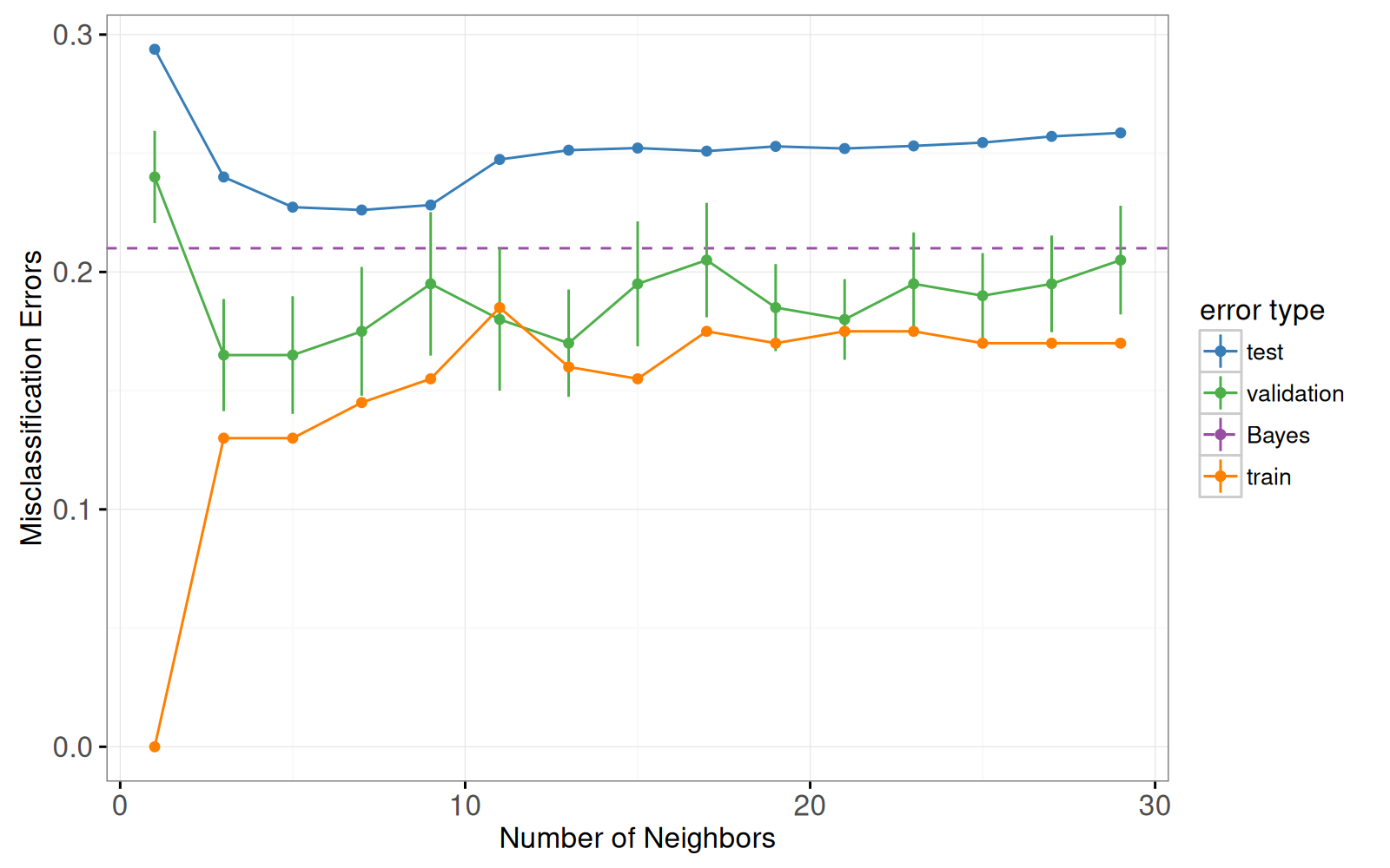
Voici un graphique de l'erreur de validation à 10 divisions et un graphique des prédictions du classificateur 7 plus proches voisins.
<!-- comment -->
- Nous proposons deux refontes. Grâce à la première vous pourrez sélectionner le nombre de voisins utilisés pour les prédictions du modèle
<!-- comment -->
- et grâce à la seconde, le nombre de divisions utilisés pour le calcul de l'erreur de validation croisée.
<!-- paragraph -->
## Figure statique originale {#knn-static}
<!-- paragraph -->
Notre but dans ce chapitre est de reproduire une version interactive de la figure 13.4 dans le livre [Elements of Statistical Learning](http://statweb.stanford.edu/~tibs/ElemStatLearn/) [@Hastie2009].
<!-- comment -->
Cette figure se compose de deux graphiques :
<!-- paragraph -->
<!-- paragraph -->
A gauche : courbes d'erreur de mauvaise classification, en fonction du nombre de voisins.
<!-- paragraph -->
- `geom_line` et `geom_point` pour les courbes d'erreur.
<!-- comment -->
- `geom_linerange` pour les barres d'erreur de la courbe d'erreur de validation.
<!-- comment -->
- `geom_hline` pour l'erreur de Bayes.
<!-- comment -->
- x = voisins.
<!-- comment -->
- y = pourcentage d'erreur.
<!-- comment -->
- couleur = type d'erreur.
<!-- paragraph -->
À droite : les données et les limites de décision dans l'espace bidimensionnel des variables d'entrée.
<!-- paragraph -->
- `geom_point` pour les points de données.
<!-- comment -->
- `geom_point` pour les prédictions de classification sur la grille en arrière-plan.
<!-- comment -->
- `geom_path` pour les limites de décision.
<!-- comment -->
- `geom_text` pour les taux d'erreur train/test/Bayes.
<!-- paragraph -->
### Graphique des courbes d'erreurs de mauvaise classification {#static-error}
<!-- paragraph -->
Nous commençons par charger l'ensemble des données.
<!-- paragraph -->
```{r}
if(!file.exists("ESL.mixture.rda")){
  curl::curl_download(
    "https://web.stanford.edu/~hastie/ElemStatLearn/datasets/ESL.mixture.rda",
    "ESL.mixture.rda")
}
load("ESL.mixture.rda")
str(ESL.mixture)
```
<!-- paragraph -->
Nous utiliserons les éléments suivants de cet ensemble de données :
<!-- paragraph -->
- `x`, la matrice des variables d'entrée, de l'ensemble de données d'apprentissage (200 observations sur les lignes x 2 variables numériques sur les colonnes).
<!-- comment -->
- `y`, le vecteur de sortie, de l'ensemble de données d'apprentissage (200 étiquettes de classe, soit 0 ou 1).
<!-- comment -->
- `xnew`, la matrice représentant la grille de points dans l'espace des variables d'entrée, où seront affichées les prédictions de la fonction de classification (6831 points de la grille sur les lignes x 2 variables numériques sur les colonnes).
<!-- comment -->
- `prob`, la probabilité de la classe 1 à chacun des points de la grille (6831 valeurs numériques comprises entre 0 et 1).
<!-- comment -->
- `px1`, la grille de points pour le premier variable d'entrée (69 valeurs numériques comprises entre -2,6 et 4,2).
<!-- comment -->
Ces points seront utilisés pour calculer la limite de décision de Bayes à l'aide de la fonction `contourLines`.
<!-- comment -->
- `px2`, la grille de points pour la deuxième variable d'entrée (99 valeurs numériques comprises entre -2 et 2,9).
<!-- comment -->
- `means`, les 20 centres des distributions normales dans le modèle de simulation (20 centres sur les lignes x 2 variables sur les colonnes).
<!-- paragraph -->
Tout d'abord, nous créons un ensemble de tests, en suivant le code d'exemple de `help(ESL.mixture)`.
<!-- comment -->
Notez que nous utilisons un `data.table` plutôt qu'un `data.frame` pour stocker ces données volumineuses, puisque `data.table` est souvent plus rapide et plus économe en mémoire pour les ensembles de données volumineux.
<!-- paragraph -->
```{r}
library(MASS)
library(data.table)
set.seed(123)
centers <- c(
  sample(1:10, 5000, replace=TRUE),
  sample(11:20, 5000, replace=TRUE))
mix.test <- mvrnorm(10000, c(0,0), 0.2*diag(2))
test.points <- data.table(
  mix.test + ESL.mixture$means[centers,],
  label=factor(c(rep(0, 5000), rep(1, 5000))))
test.points
```
<!-- paragraph -->
Nous créons ensuite un tableau de données qui comprend tous les points de test et les points de la grille, que nous utiliserons dans l'argument de test de la fonction KPPV.
<!-- paragraph -->
```{r}
pred.grid <- data.table(ESL.mixture$xnew, label=NA)
input.cols <- c("V1", "V2")
names(pred.grid)[1:2] <- input.cols
test.and.grid <- rbind(
  data.table(test.points, set="test"),
  data.table(pred.grid, set="grid"))
test.and.grid$fold <- NA
test.and.grid
```
<!-- paragraph -->
Nous assignons aléatoirement chaque observation de l'ensemble de données d'apprentissage à l'un des 10 divisions.
<!-- paragraph -->
```{r}
n.folds <- 10
set.seed(2)
mixture <- with(ESL.mixture, data.table(x, label=factor(y)))
mixture$fold <- sample(rep(1:n.folds, l=nrow(mixture)))
mixture
```
<!-- paragraph -->
Nous définissons la fonction `OneFold` pour diviser les 200 observations en un ensemble d’entraînement et un ensemble de validation.
<!-- comment -->
Elle calcule ensuite la probabilité prédite par le classificateur des K Plus Proches Voisins pour chacun des points de données dans tous les ensembles (entraînement, validation, test et grille).
<!-- paragraph -->
```{r}
OneFold <- function(validation.fold){
  set <- ifelse(mixture$fold == validation.fold, "validation", "train")
  fold.data <- rbind(test.and.grid, data.table(mixture, set))
  fold.data$data.i <- 1:nrow(fold.data)
  only.train <- subset(fold.data, set == "train")
  data.by.neighbors <- list()
  for(neighbors in seq(1, 30, by=2)){
    if(interactive())cat(sprintf(
      "n.folds=%4d validation.fold=%d neighbors=%d\n",
      n.folds, validation.fold, neighbors))
    set.seed(1)
    pred.label <- class::knn( # random tie-breaking.
      only.train[, input.cols, with=FALSE],
      fold.data[, input.cols, with=FALSE],
      only.train$label,
      k=neighbors,
      prob=TRUE)
    prob.winning.class <- attr(pred.label, "prob")
    fold.data$probability <- ifelse(
      pred.label=="1", prob.winning.class, 1-prob.winning.class)
    fold.data[, pred.label := ifelse(0.5 < probability, "1", "0")]
    fold.data[, is.error := label != pred.label]
    fold.data[, prediction := ifelse(is.error, "erronée", "correcte")]
    data.by.neighbors[[paste(neighbors)]] <-
      data.table(neighbors, fold.data)
  }#for(neighbors
  do.call(rbind, data.by.neighbors)
}#for(validation.fold
```
<!-- paragraph -->
Ci-dessous, nous exécutons la fonction `OneFold` en parallèle à l'aide du package `future`.
<!-- comment -->
Pour `validation.fold` de 1 à 10, on calcule l'erreur de l'ensemble de validation.
<!-- comment -->
Pour `validation.fold=0`, on traite l'ensemble des 200 observations comme un ensemble d'entraînement, qui sera utilisé pour visualiser les frontières de décision apprises avec K Plus Proches Voisins.
<!-- paragraph -->
```{r}
future::plan("multisession")
data.all.folds.list <- future.apply::future_lapply(
  0:n.folds, function(validation.fold){
    one.fold <- OneFold(validation.fold)
    data.table(validation.fold, one.fold)
  }, future.seed = NULL)
(data.all.folds <- do.call(rbind, data.all.folds.list))
```
<!-- paragraph -->
Le tableau de données des prédictions contient près de 3 millions d'observations !
<!-- comment -->
Lorsqu'il y a autant de données, les visualiser toutes en même temps n'est ni pratique ni informatif.
<!-- comment -->
Au lieu de les visualiser simultanément, nous allons calculer et tracer des statistiques sommaires.
<!-- comment -->
Dans le code ci-dessous, nous calculons la moyenne et l'erreur standard de l'erreur de mauvaise classification pour chaque modèle (sur les 10 divisions dans la validation croisée).
<!-- comment -->
Ceci est un exemple de [l'idiome summarize data table](Ch99-appendix.html#summarize-data-table) qui est généralement utile pour calculer des statistiques sommaires pour un tableau de données unique.
<!-- paragraph -->
```{r}
labeled.data <- data.all.folds[!is.na(label),]
error.stats <- labeled.data[, list(
  error.prop=mean(is.error)
  ), by=.(set, validation.fold, neighbors)]
validation.error <- error.stats[set=="validation", list(
  mean=mean(error.prop),
  sd=sd(error.prop)/sqrt(.N)
  ), by=.(set, neighbors)]
validation.error
```
<!-- paragraph -->
Nous construisons ci-dessous des tableaux de données pour l'erreur d’entraînement et pour l'erreur de Bayes (nous savons qu'elle est de 0,21 pour les données de l'exemple de mélange).
<!-- paragraph -->
```{r}
Bayes.error <- data.table(
  set="Bayes",
  validation.fold=NA,
  neighbors=NA,
  error.prop=0.21)
Bayes.error
other.error <- error.stats[validation.fold==0,]
head(other.error)
```
<!-- paragraph -->
Ci-dessous, nous construisons une palette de couleurs à partir de `dput(RColorBrewer::brewer.pal(Inf, "Set1"))` et des palettes de types de lignes (`linetype`).
<!-- paragraph -->
```{r}
set.colors <- c(
  test="#377EB8", #blue
  Bayes="#984EA3",#purple
  validation="#4DAF4A",#green
  entraînement="#FF7F00")#orange
classifier.linetypes <- c(
  Bayes="dashed",
  KPPV="solid")
set.linetypes <- set.colors
set.linetypes[] <- classifier.linetypes[["KPPV"]]
set.linetypes["Bayes"] <- classifier.linetypes[["Bayes"]]
cbind(set.linetypes, set.colors)
```
<!-- paragraph -->
Le code ci-dessous reproduit le graphique des courbes d'erreur de la figure originale.
<!-- paragraph -->
```{r}
library(animint2)
add_set_fr <- function(DT)DT[
, set_fr := ifelse(set=="train", "entraînement", set)]
add_set_fr(other.error)
add_set_fr(validation.error)
add_set_fr(Bayes.error)
legend.name.type <- "erreur"
errorPlotStatic <- ggplot()+
  theme_bw()+
  geom_hline(aes(
    yintercept=error.prop, color=set_fr, linetype=set_fr),
    data=Bayes.error)+
  scale_color_manual(
    legend.name.type, values=set.colors, breaks=names(set.colors))+
  scale_linetype_manual(
    legend.name.type, values=set.linetypes, breaks=names(set.linetypes))+
  ylab("Taux d’erreur")+
  xlab("Nombre de voisins")+
  geom_linerange(aes(
    neighbors, ymin=mean-sd, ymax=mean+sd,
    color=set_fr),
    data=validation.error)+
  geom_line(aes(
    neighbors, mean, linetype=set_fr, color=set_fr),
    data=validation.error)+
  geom_line(aes(
    neighbors, error.prop,
    group=set_fr, linetype=set_fr, color=set_fr),
    data=other.error)+
  geom_point(aes(
    neighbors, mean, color=set_fr),
    data=validation.error)+
  geom_point(aes(
    neighbors, error.prop, color=set_fr),
    data=other.error)
errorPlotStatic
```
<!-- paragraph -->
### Graphique des limites de décision dans l'espace des variables d'entrée. {#static-features}
<!-- paragraph -->
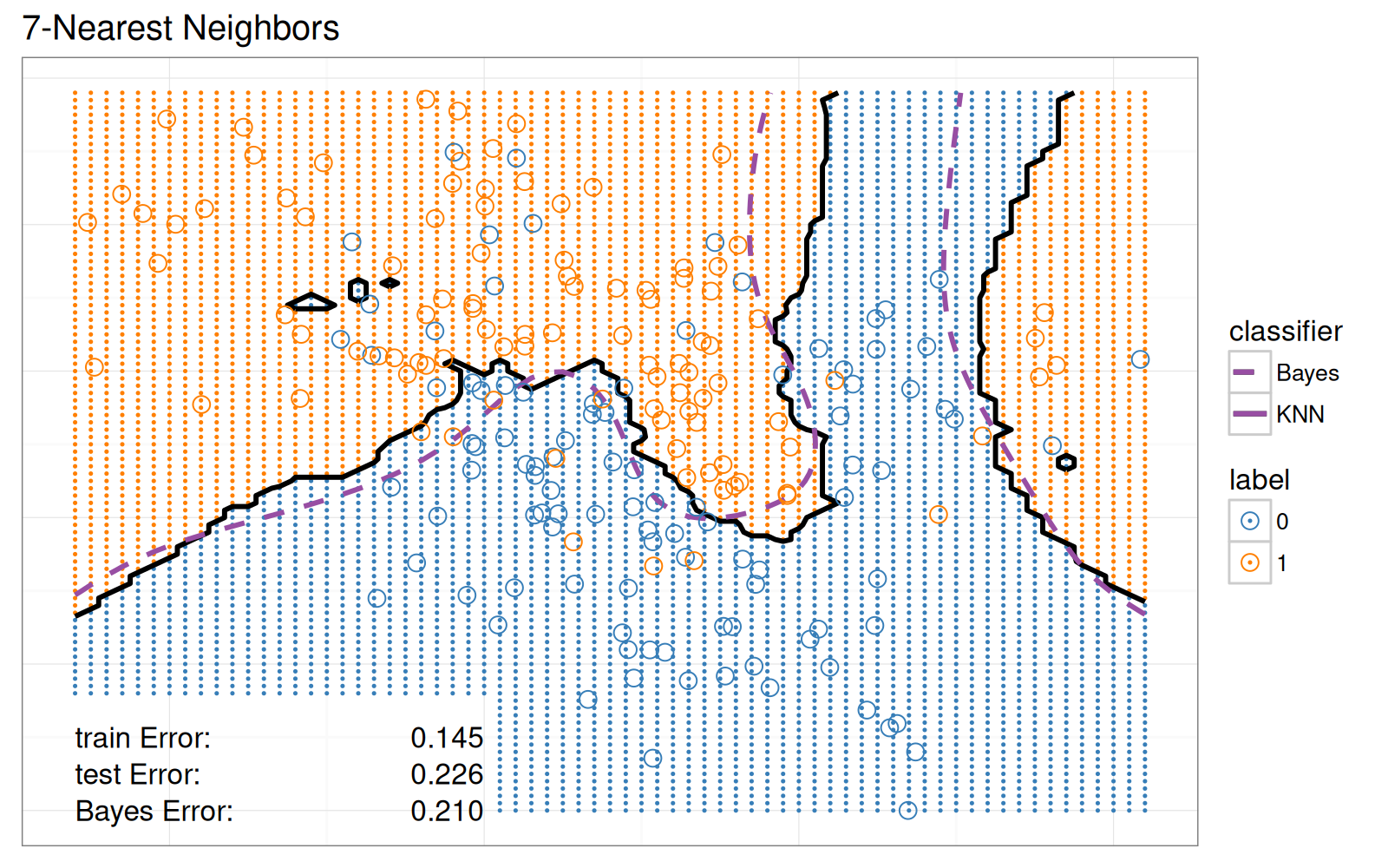
Pour la visualisation statique des données de l'espace des variables, nous ne montrons que le modèle avec 7 voisins.
<!-- paragraph -->
```{r}
show.neighbors <- 7
show.data <- data.all.folds[validation.fold==0 & neighbors==show.neighbors,]
show.points <- show.data[set=="train",]
show.points
```
<!-- paragraph -->
Ensuite, nous calculons les taux d'erreur de mauvaise classification, que nous afficherons en bas à gauche du graphique de l'espace des variables.
<!-- paragraph -->
```{r}
text.height <- 0.25
text.V1.prop <- 0
text.V2.bottom <- -2
text.V1.error <- -2.6
error.text <- rbind(
  Bayes.error,
  other.error[neighbors==show.neighbors,])
error.text[, V2.top := text.V2.bottom + text.height * (1:.N)]
error.text[, V2.bottom := V2.top - text.height]
error.text
```
<!-- paragraph -->
Nous définissons la fonction suivante que nous utiliserons pour calculer les limites de décision.
<!-- paragraph -->
```{r}
getBoundaryDF <- function(prob.vec){
  stopifnot(length(prob.vec) == 6831)
  several.paths <- with(ESL.mixture, contourLines(
    px1, px2,
    matrix(prob.vec, length(px1), length(px2)),
    levels=0.5))
  contour.list <- list()
  for(path.i in seq_along(several.paths)){
    contour.list[[path.i]] <- with(several.paths[[path.i]], data.table(
      path.i, V1=x, V2=y))
  }
  do.call(rbind, contour.list)
}
```
<!-- paragraph -->
Nous utilisons cette fonction pour calculer les limites de décision pour les 7 plus proches voisins et pour la fonction optimale de Bayes.
<!-- paragraph -->
```{r}
boundary.grid <- show.data[set=="grid",]
boundary.grid[, label := pred.label]
pred.boundary <- getBoundaryDF(boundary.grid$probability)
pred.boundary$classifier <- "KPPV"
Bayes.boundary <- getBoundaryDF(ESL.mixture$prob)
Bayes.boundary$classifier <- "Bayes"
Bayes.boundary
```
<!-- paragraph -->
Ci-dessous, nous ne considérons que les points de la grille qui ne chevauchent pas les étiquettes de texte.
<!-- paragraph -->
```{r}
on.text <- function(V1, V2){
  V2 <= max(error.text$V2.top) & V1 <= text.V1.prop
}
show.grid <- boundary.grid[!on.text(V1, V2),]
show.grid
```
<!-- paragraph -->
Le nuage de points ci-dessous reproduit le classificateur des 7 Plus Proches Voisins de la figure originale.
<!-- paragraph -->
```{r}
label.colors <- c(
  "0"="#377EB8",
  "1"="#FF7F00")
scatterPlotStatic <- ggplot()+
  theme_bw()+
  theme(axis.text=element_blank(),
        axis.ticks=element_blank(),
        axis.title=element_blank())+
  ggtitle("7-Plus proches voisins")+
  scale_color_manual(
    "classe",
    values=label.colors)+
  scale_linetype_manual(
    "méthode",
    values=classifier.linetypes)+
  geom_point(aes(
    V1, V2, color=label),
    size=0.2,
    data=show.grid)+
  geom_path(aes(
    V1, V2, group=path.i, linetype=classifier),
    size=1,
    data=pred.boundary)+
  geom_path(aes(
    V1, V2, group=path.i, linetype=classifier),
    color=set.colors[["Bayes"]],
    size=1,
    data=Bayes.boundary)+
  geom_point(aes(
    V1, V2, color=label),
    fill=NA,
    size=3,
    shape=21,
    data=show.points)+
  geom_text(aes(
    text.V1.error, V2.bottom,
    label=paste("Err.", set_fr, ":")),
    data=error.text,
    hjust=0)+
  geom_text(aes(
    text.V1.prop, V2.bottom, label=sprintf("%.3f", error.prop)),
    data=error.text,
    hjust=1)
scatterPlotStatic
```
<!-- paragraph -->
### Graphiques combinés {#static-combined}
<!-- paragraph -->
Enfin, nous combinons les deux `ggplots` et les affichons sous forme d'`animint2`.
<!-- paragraph -->
```{r Ch10-viz-static}
animint(
  errorPlotStatic+
    theme_animint(width=300),
  scatterPlotStatic+
    theme_animint(last_in_row=TRUE))
```
<!-- paragraph -->
Bien que cette visualisation des données comporte trois légendes interactives, elle est statique dans le sens où elle n'affiche que les prédictions du modèle des 7 Plus Proches Voisins.
<!-- paragraph -->
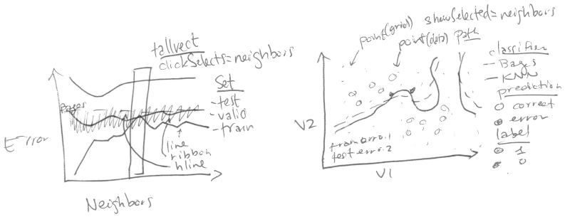
## Sélectionner le nombre de voisins à l'aide de l'interactivité {#neighbors}
<!-- paragraph -->
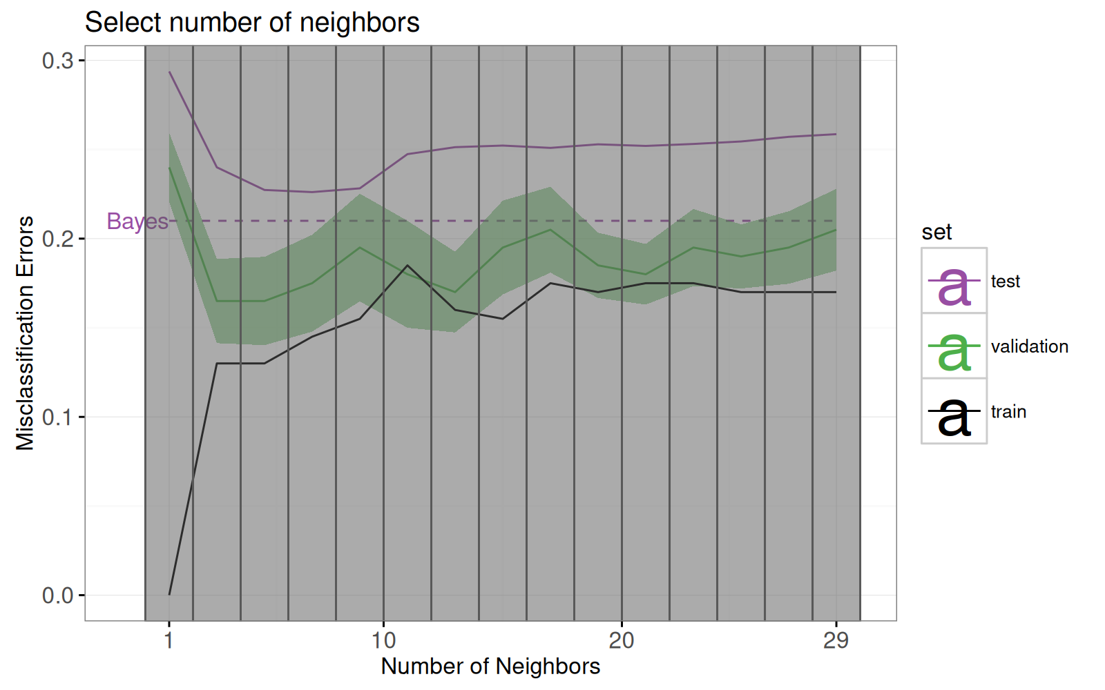
Dans cette section, nous proposons une visualisation interactive qui permet à l'utilisateur de sélectionner K, le nombre de voisins.
### Graphique interactif des courbes d'erreur {#neighbors-error}
<!-- paragraph -->
Examinons d'abord la refonte du graphique des courbes d'erreur.
<!-- paragraph -->
Notez les changements suivants :
<!-- paragraph -->
- ajout d'un sélecteur pour le nombre de voisins (`geom_tallrect`).
<!-- comment -->
- changement de la limite de décision de Bayes de `geom_hline` avec une entrée de légende, vers un `geom_segment` avec une étiquette de texte.
<!-- comment -->
- ajout d'une légende de type de ligne pour distinguer les taux d'erreur des modèles de Bayes et de KPPV.
<!-- comment -->
- changement des barres d'erreur ( `geom_linerange` ) en bandes d'erreur (`geom_ribbon`).
<!-- paragraph -->
Les seules nouvelles données que nous devons définir sont les points d'extrémité du segment que nous utiliserons pour tracer la frontière de décision de Bayes.
<!-- comment -->
À noter que nous redéfinissons également l'ensemble "test" pour souligner que l'erreur de Bayes représente le meilleur taux d'erreur atteignable pour les données de test.
<!-- paragraph -->
```{r}
Bayes.segment <- data.table(
  Bayes.error,
  classifier="Bayes",
  min.neighbors=1,
  max.neighbors=29)
Bayes.segment$set_fr <- "test"
```
<!-- paragraph -->
Nous ajoutons également aux tableaux de données une variable d'erreur qui contient l'erreur de prédiction des modèles de type KPPV.
<!-- comment -->
Cette variable d'erreur sera utilisée pour la légende du type de ligne.
<!-- paragraph -->
```{r}
validation.error$classifier <- "KPPV"
other.error$classifier <- "KPPV"
```
<!-- paragraph -->
Nous redéfinissons le graphique des courbes d'erreur ci-dessous.
<!-- comment -->
À noter que :
<!-- paragraph -->
- Nous utilisons `showSelected` dans `geom_text` et `geom_ribbon` afin qu'ils soient masqués lorsque l'on clique sur les légendes interactives.
<!-- comment -->
- Nous utilisons `clickSelects` dans `geom_tallrect` pour sélectionner le nombre de voisins.
<!-- comment -->
Les geoms cliquables doivent être placés en dernier (couche supérieure) afin de ne pas être masqués par les geoms non cliquables (couches inférieures).
<!-- paragraph -->
```{r}
set.colors <- c(
  test="#984EA3",#purple
  validation="#4DAF4A",#green
  Bayes="#984EA3",#purple
  entraînement="black")
legend.name <- "Ensemble"
errorPlot <- ggplot()+
  ggtitle("Sélection du nombre de voisins")+
  theme_bw()+
  geom_text(aes(
    min.neighbors, error.prop,
    color=set_fr, label="Bayes"),
    showSelected="classifier",
    hjust=1,
    data=Bayes.segment)+
  geom_segment(aes(
    min.neighbors, error.prop,
    xend=max.neighbors, yend=error.prop,
    color=set_fr,
    linetype=classifier),
    showSelected="classifier",
    data=Bayes.segment)+
  scale_color_manual(
    legend.name,
    values=set.colors, breaks=names(set.colors))+
  scale_fill_manual(
    legend.name,
    values=set.colors)+
  scale_linetype_manual(
    legend.name,
    values=classifier.linetypes)+
  guides(fill="none", linetype="none")+
  ylab("Taux d’erreur de classification")+
  scale_x_continuous(
    "Nombre de Voisins",
    limits=c(-1, 30),
    breaks=c(1, 10, 20, 29))+
  geom_ribbon(aes(
    neighbors, ymin=mean-sd, ymax=mean+sd,
    fill=set_fr),
    showSelected=c("classifier", "set_fr"),
    alpha=0.5,
    color="transparent",
    data=validation.error)+
  geom_line(aes(
    neighbors, mean, color=set_fr,
    linetype=classifier),
    showSelected="classifier",
    data=validation.error)+
  geom_line(aes(
    neighbors, error.prop, group=set_fr, color=set_fr,
    linetype=classifier),
    showSelected="classifier",
    data=other.error)+
  geom_tallrect(aes(
    xmin=neighbors-1, xmax=neighbors+1),
    clickSelects="neighbors",
    alpha=0.5,
    data=validation.error)
errorPlot
```
<!-- paragraph -->
### Graphique de l'espace des éléments montrant le nombre de voisins sélectionnés. {#neighbors-features}
<!-- paragraph -->
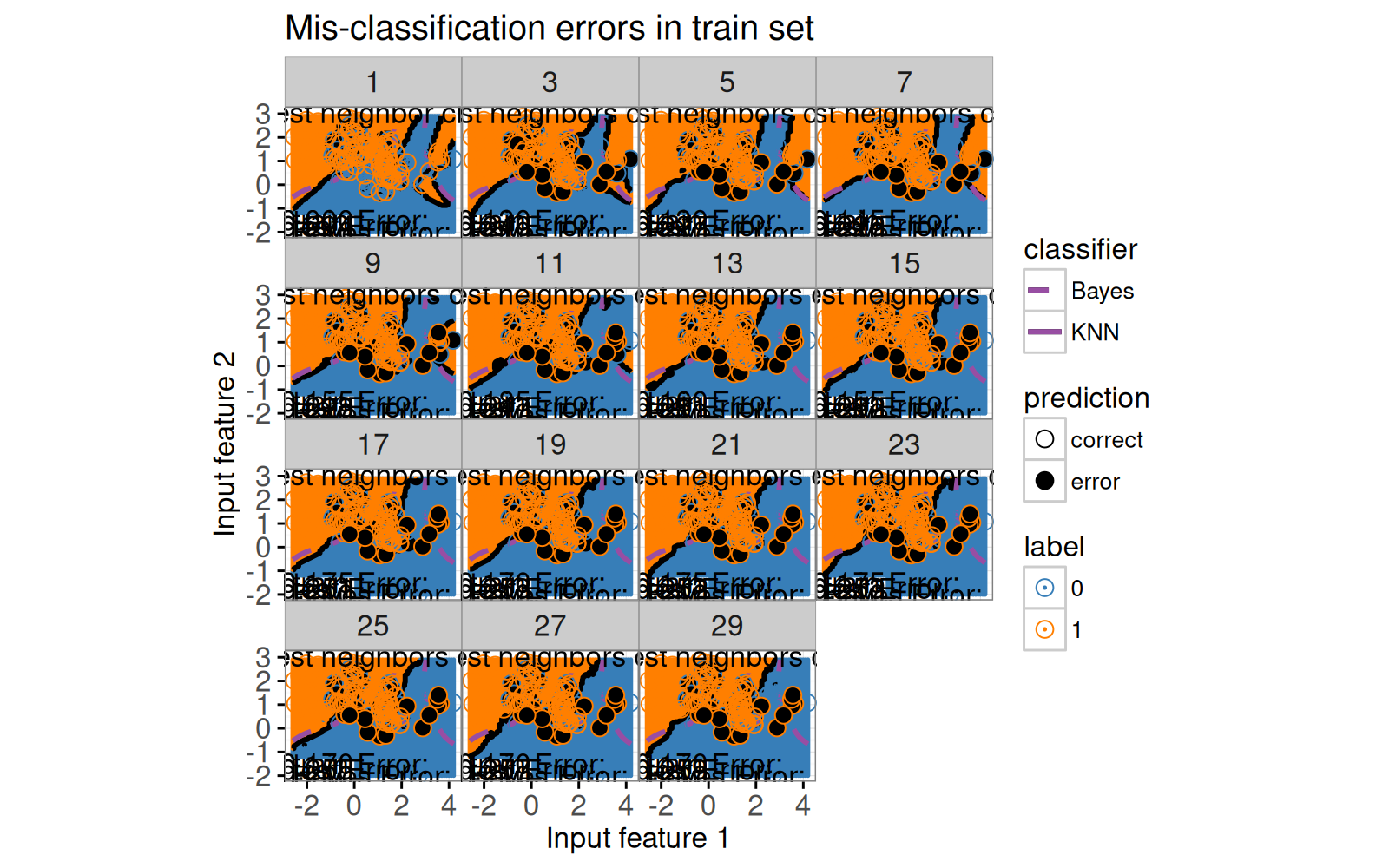
Concentrons nous ensuite sur la refonte du graphique de l'espace des caractéristiques.
<!-- comment -->
Dans la section précédente, nous n'avons considéré que le sous-ensemble de données du modèle à 7 voisins.
<!-- comment -->
Notre refonte comprend les changements suivants :
<!-- paragraph -->
- Nous utilisons les voisins comme variable `showSelected`.
<!-- comment -->
- Nous ajoutons une légende pour indiquer les points de données d'entraînement mal classés.
<!-- comment -->
- Nous utilisons des coordonnées à espacement égal afin que la distance visuelle (pixels) soit la même que la distance euclidienne dans l'espace des variables.
<!-- paragraph -->
```{r}
show.data <- data.all.folds[validation.fold==0,]
show.points <- show.data[set=="train",]
show.points
```
<!-- paragraph -->
Ci-dessous, nous calculons les limites de décision prédites séparément pour chaque modèle de K Plus Proches Voisins.
<!-- paragraph -->
```{r}
boundary.grid <- show.data[set=="grid",]
boundary.grid[, label := pred.label]
show.grid <- boundary.grid[!on.text(V1, V2),]
pred.boundary <- boundary.grid[, getBoundaryDF(probability), by=neighbors]
pred.boundary$classifier <- "KPPV"
pred.boundary
```
<!-- paragraph -->
Au lieu d'afficher le nombre de voisins dans le titre du graphique, nous créons ci-dessous un élément `geom_text` qui sera mis à jour en fonction du nombre de voisins sélectionnés.
<!-- paragraph -->
```{r}
show.text <- show.grid[, list(
  V1=mean(range(V1)), V2=3.05), by=neighbors]
```
<!-- paragraph -->
Nous calculons ci-dessous la position du texte qui affichera, en bas à gauche, le taux d'erreur du modèle sélectionné.
<!-- paragraph -->
```{r}
other.error[, V2.bottom := rep(
  text.V2.bottom + text.height * 1:2, l=.N)]
```
<!-- paragraph -->
Ci-dessous, nous redéfinissons les données de l'erreur de Bayes sans colonne de voisins, afin qu'elles apparaissent dans chaque sous-ensemble `showSelected`.
<!-- paragraph -->
```{r}
Bayes.error <- data.table(
  set_fr="Bayes",
  error.prop=0.21)
```
<!-- paragraph -->
Enfin, nous redéfinissons le `ggplot`, en utilisant les voisins ("neighbors") comme variable `showSelected` dans les geoms point, "path" et texte.
<!-- paragraph -->
```{r}
scatterPlot <- ggplot()+
  ggtitle("Erreurs de classification (entraînement)")+
  theme_bw()+
  xlab("Variable d'entrée 1")+
  ylab("Variable d'entrée 2")+
  coord_equal()+
  scale_linetype_manual(
    "méthode", values=classifier.linetypes)+
  scale_fill_manual(
    "prédiction",
    values=c(erronée="black", correcte="transparent"))+
  scale_color_manual("classe", values=label.colors)+
  geom_point(aes(
    V1, V2, color=label),
    showSelected="neighbors",
    size=0.2,
    data=show.grid)+
  geom_path(aes(
    V1, V2, group=path.i, linetype=classifier),
    showSelected="neighbors",
    size=1,
    data=pred.boundary)+
  geom_path(aes(
    V1, V2, group=path.i, linetype=classifier),
    color=set.colors[["test"]],
    size=1,
    data=Bayes.boundary)+
  geom_point(aes(
    V1, V2, color=label,
    fill=prediction),
    showSelected="neighbors",
    size=3,
    shape=21,
    data=show.points)+
  geom_text(aes(
    text.V1.error, text.V2.bottom, label=paste("Err.", set_fr, ":")),
    data=Bayes.error,
    hjust=0)+
  geom_text(aes(
    text.V1.prop, text.V2.bottom, label=sprintf("%.3f", error.prop)),
    data=Bayes.error,
    hjust=1)+
  geom_text(aes(
    text.V1.error, V2.bottom, label=paste("Err.", set_fr, ":")),
    showSelected="neighbors",
    data=other.error,
    hjust=0)+
  geom_text(aes(
    text.V1.prop, V2.bottom, label=sprintf("%.3f", error.prop)),
    showSelected="neighbors",
    data=other.error,
    hjust=1)+
  geom_text(aes(
    V1, V2,
    label=paste0(neighbors, "-PPV")),
    showSelected="neighbors",
    data=show.text)
```
<!-- paragraph -->
Avant de compiler la visualisation des données interactive, nous imprimons un `ggplot` statique avec une facette pour chaque valeur de voisins.
<!-- paragraph -->
```{r}
scatterPlot+
  facet_wrap("neighbors")+
  theme(panel.margin=grid::unit(0, "lines"))
```
<!-- paragraph -->
### Visualisation des données interactive combinée {#neighbors-combined}
<!-- paragraph -->
Enfin, nous combinons les deux graphiques dans une visualisation des données unique avec les voisins comme variable de sélection.
<!-- paragraph -->
```{r Ch10-viz-neighbors}
animint(
  errorPlot+
    theme_animint(width=300),
  scatterPlot+
    theme_animint(width=450, last_in_row=TRUE),
  first=list(neighbors=7),
  time=list(variable="neighbors", ms=3000))
```
<!-- paragraph -->
Notez que les voisins ("neighbors") sont utilisés comme variable de temps, de sorte que l'animation montre les prédictions des différents modèles.
<!-- paragraph -->
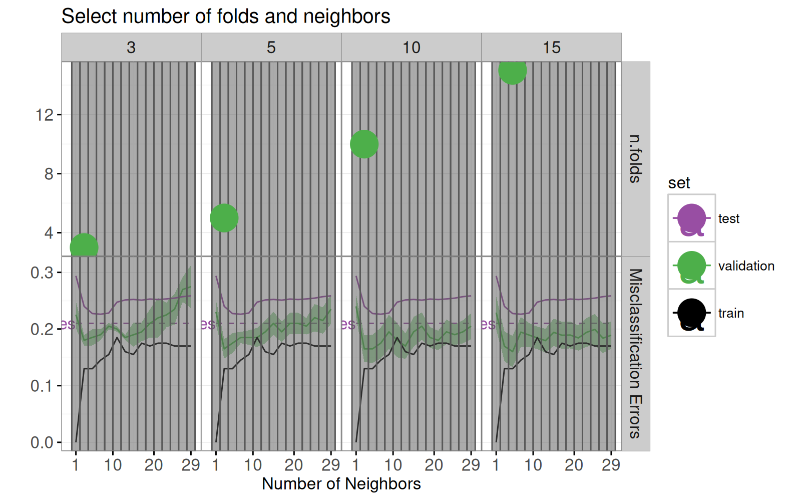
## Sélectionner le nombre de divisions dans la validation croisée {#folds}
<!-- paragraph -->
Dans cette section, nous faisons une visualisation qui permet à l'utilisateur de sélectionner le nombre de divisions utilisés pour calculer la courbe d'erreur de validation.
<!-- paragraph -->
La boucle `for` ci-dessous calcule la courbe d'erreur de validation pour plusieurs valeurs différentes de `n.folds`.
<!-- paragraph -->
```{r}
error.by.folds <- list()
error.by.folds[["10"]] <- data.table(n.folds=10, validation.error)
for(n.folds in c(3, 5, 15)){
  set.seed(2)
  mixture <- with(ESL.mixture, data.table(x, label=factor(y)))
  mixture$fold <- sample(rep(1:n.folds, l=nrow(mixture)))
  only.validation.list <- future.apply::future_lapply(
    1:n.folds, function(validation.fold){
      one.fold <- OneFold(validation.fold)
      data.table(validation.fold, one.fold[set=="validation"])
    }, future.seed=NULL)
  only.validation <- do.call(rbind, only.validation.list)
  only.validation.error <- only.validation[, list(
    error.prop=mean(is.error)
  ), by=.(set, set_fr=set, validation.fold, neighbors)]
  only.validation.stats <- only.validation.error[, list(
    mean=mean(error.prop),
    sd=sd(error.prop)/sqrt(.N)
  ), by=.(set, set_fr=set, neighbors)]
  error.by.folds[[paste(n.folds)]] <-
    data.table(n.folds, only.validation.stats, classifier="KPPV")
}
validation.error.several <- do.call(rbind, error.by.folds)
```
<!-- paragraph -->
Le code ci-dessous calcule le minimum de la courbe d'erreur pour chaque valeur de `n.folds`.
<!-- paragraph -->
```{r}
min.validation <- validation.error.several[, .SD[which.min(mean),], by=n.folds]
```
<!-- paragraph -->
Le code ci-dessous crée un nouveau graphique de courbe d'erreur à deux facettes.
<!-- paragraph -->
```{r}
facets <- function(df, facet){
  data.frame(df, facet=factor(facet, c("Divisions", "Taux d’erreur")))
}
errorPlotNew <- ggplot()+
  ggtitle("Sélection du nombre de divisions et de voisins")+
  theme_bw()+
  theme(panel.margin=grid::unit(0, "cm"))+
  facet_grid(facet ~ ., scales="free")+
  geom_text(aes(
    min.neighbors, error.prop,
    color=set_fr, label="Bayes"),
    showSelected="classifier",
    hjust=1,
    data=facets(Bayes.segment, "Taux d’erreur"))+
  geom_segment(aes(
    min.neighbors, error.prop,
    xend=max.neighbors, yend=error.prop,
    color=set_fr,
    linetype=classifier),
    showSelected="classifier",
    data=facets(Bayes.segment, "Taux d’erreur"))+
  scale_color_manual(
    legend.name, values=set.colors, breaks=names(set.colors))+
  scale_fill_manual(
    legend.name, values=set.colors, breaks=names(set.colors))+
  scale_linetype_manual(
    legend.name, values=classifier.linetypes)+
  guides(fill="none", linetype="none")+
  ylab("")+
  scale_x_continuous(
    "Nombre de Voisins",
    limits=c(-1, 30),
    breaks=c(1, 10, 20, 29))+
  geom_ribbon(aes(
    neighbors, ymin=mean-sd, ymax=mean+sd,
    fill=set_fr),
    showSelected=c("classifier", "set_fr", "n.folds"),
    alpha=0.5,
    color="transparent",
    data=facets(validation.error.several, "Taux d’erreur"))+
  geom_line(aes(
    neighbors, mean, color=set_fr,
    linetype=classifier),
    showSelected=c("classifier", "n.folds"),
    data=facets(validation.error.several, "Taux d’erreur"))+
  geom_line(aes(
    neighbors, error.prop, group=set_fr, color=set_fr,
    linetype=classifier),
    showSelected="classifier",
    data=facets(other.error, "Taux d’erreur"))+
  geom_tallrect(aes(
    xmin=neighbors-1, xmax=neighbors+1),
    clickSelects="neighbors",
    alpha=0.5,
    data=validation.error)+
  geom_point(aes(
    neighbors, n.folds, color=set_fr),
    clickSelects="n.folds",
    size=9,
    data=facets(min.validation, "Divisions"))
```
<!-- paragraph -->
Le code ci-dessous prévisualise le nouveau graphique de la courbe d'erreur, en ajoutant une facette supplémentaire pour la variable `showSelected`.
<!-- paragraph -->
```{r}
errorPlotNew+facet_grid(facet ~ n.folds, scales="free")
```
<!-- paragraph -->
Le code ci-dessous crée une visualisation des données interactive à l'aide du nouveau graphique de la courbe d'erreur.
<!-- paragraph -->
```{r Ch10-viz-folds}
animint(
  errorPlotNew+
    theme_animint(width=325),
  scatterPlot+
    theme_animint(width=450, last_in_row=TRUE),
  first=list(neighbors=7, n.folds=10))
```
<!-- paragraph -->
## Résumé du chapitre et exercices {#ch10-exercises}
<!-- paragraph -->
Nous avons montré comment ajouter deux fonctionnalités interactives à une visualisation des données des prédictions du modèle des K Plus Proches Voisins ("K-Nearest-Neighbors").
<!-- comment -->
Nous avons commencé par une visualisation des données statique qui ne montrait que les prédictions du modèle des 7 Plus Proches Voisins.
<!-- comment -->
Ensuite, nous avons créé une refonte interactive qui permettait de sélectionner K, le nombre de voisins.
<!-- comment -->
Nous avons procédé à une autre refonte en ajoutant une facette permettant de sélectionner le nombre de divsions dans la validation croisée.
<!-- paragraph -->
Exercices :
<!-- paragraph -->
- Faites en sorte que les taux d'erreur du texte affichés en bas à gauche du deuxième graphique soient masqués quand on clique sur les entrées de la légende pour Bayes, train, test.
<!-- comment -->
Conseil : vous pouvez soit utiliser un `geom_text` avec `showSelected=c(selectorNameColumn="selectorValueColumn")` (comme expliqué dans le [chapitre 14](Ch14-PeakSegJoint.html) ) ou deux `geom_text` chacun avec un paramètre `showSelected` différent.
<!-- comment -->
- La colonne de probabilité ("probability") du tableau de données `show.grid` est la probabilité prédite de la classe 1.
<!-- comment -->
Comment feriez-vous la refonte de la visualisation pour montrer la probabilité prédite plutôt que la classe prédite à chaque point de la grille ?
<!-- comment -->
La difficulté principale est que la probabilité est une variable numérique, mais que `ggplot2` impose que chaque échelle soit exclusivement continue ou discrète (pas les deux).
<!-- comment -->
Vous pourriez utiliser une échelle de remplissage continue ("continuous fill scale"), mais vous devrez alors utiliser une échelle différente pour montrer la variable de prédiction.
<!-- comment -->
- Ajoutez un nouveau graphique qui montre les tailles relatives des ensembles d'entrainement ("train"), de validation et de test.
<!-- comment -->
Assurez-vous que la taille tracée des ensembles de validation et d'entraînement change en fonction de la valeur sélectionnée de `n.folds`.
<!-- comment -->
- Jusqu'à présent, les graphiques de l'espace des variables ne montraient que les prédictions et les erreurs du modèle pour l'ensemble des données d'entrainement (`validation.fold==0`).
<!-- comment -->
Créez une visualisation qui inclut un nouveau graphique ou une nouvelle facette pour sélectionner `validation.fold`, et un graphique de l'espace des variables avec facettes (une facette pour l'ensemble de données d'entrainement, une facette pour l'ensemble de données de validation).
<!-- paragraph -->
Dans le [chapitre 11](Ch11-lasso.html), nous vous expliquerons comment visualiser le `Lasso`, un modèle d'apprentissage automatique.
<!-- paragraph -->